Whatswhere
Find the app that functions in your destination.
Before I delve into introducing the app, I'd like to ask you a question:
“How do you typically use your phone?”
Got your answer? Whether it's for finding directions, listening to music, or searching for information, we've come to rely on our phones as versatile tools for numerous tasks, especially when we're at home.
But, have you ever found yourself concerned about whether these functions might be limited or unavailable when you're traveling abroad?
This is where Whatswhere comes in – a solution designed to eliminate such worries, ensuring that your phone remains just as functional and helpful, no matter where you are in the world.
My Role: UX Designer and Researcher
Date: April 2023 - June 2023
Deliverables: Survey, Interviews, Competitor Analysis, Information Architecture, Lo-fi prototype, Usability Testing, Design System and Hi-fi prototype
Background:
When I was in Hong Kong, the convenience of smartphones and apps was something I took for granted. Everything from banking and entertainment to shopping and communication was effortlessly managed through my phone, without a second thought.
However, this changed when I moved to the UK. As an immigrant, I noticed a shift in my behavior – I began favoring in-person solutions like visiting branches or making phone calls for tasks that could easily be handled online. This led me to wonder: Why had I stopped utilizing digital solutions through my phone?
The realization hit me: I was unsure of where to begin.
This observation sparked a broader question: Why do people, accustomed to digital solutions, revert to traditional, in-person services when they move abroad?
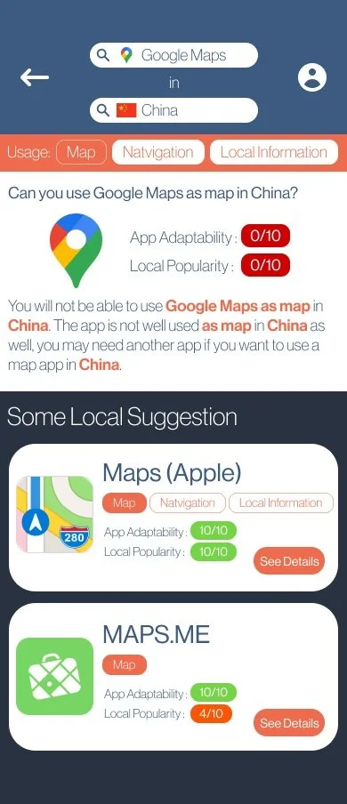
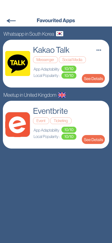
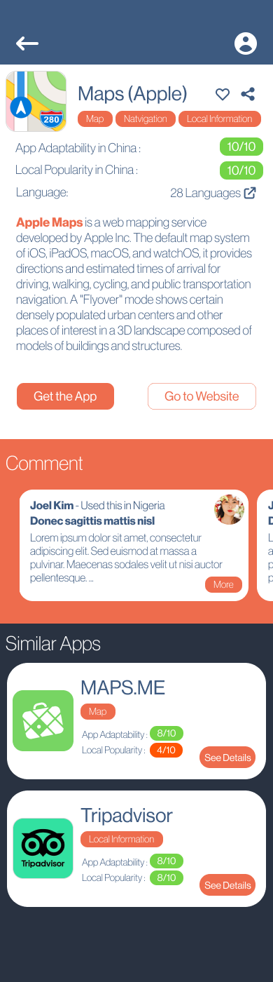
Whatswhere, my project, emerged as an answer and solution to this dilemma. It's an app designed to recommend appropriate applications for users traveling or relocating abroad. Users simply inform Whatswhere about the functionalities or similar apps they wish to use and their destination. Whatswhere then evaluates the adaptability, functionality, and popularity of those apps in the specified location. If the user's preferred app isn't optimal for their destination, Whatswhere suggests alternatives that offer similar or related functionalities. Additionally, the app includes sharing and favorite features, allowing users to share their discoveries with others and save them for future reference.
Curious about how I transformed this question into a practical app solution? I'll be detailing the entire process in the following sections.
Design Process
In this project, I employed the design thinking methodology, a user-centric approach that emphasizes understanding the user's needs, ideating creative solutions, prototyping, and testing. This process is iterative and flexible, allowing for continuous refinement and adaptation based on user feedback and insights. By leveraging design thinking, I aimed to ensure that the development of Whatswhere was not only innovative but also highly attuned to the real-world challenges and preferences of its users.
Empathize
With the guiding principle, the initial step was to validate it by ascertaining if other migrants and travelers encountered similar challenges. To accomplish this, I embarked on a research phase, utilizing surveys and interviews as my primary tools. This approach was aimed at gathering a broad range of insights and experiences, ensuring a comprehensive understanding of the needs and pain points of this diverse group.
Survey
I conducted two separate surveys, targeting two distinct user groups: travelers and migrants. For each group, I engaged 60 participants to gather diverse insights. The questionnaires designed for these surveys, accessible through provided links, were tailored to understand the unique experiences and needs of each group, helping to validate and refine our hypothesis effectively.
Findings
For Travelers
The study highlighted the dependency of travelers on their phones and apps, both domestically and abroad, for everyday tasks. However, there was a noticeable concern about reduced phone functionality while overseas.
Key findings include:
App Functionality Abroad: 63% of participants were aware that some apps might not work as expected in foreign countries. Despite this, only 10% proactively prepared their phones for international travel.
Experience of Malfunctions: 18.3% reported experiencing app malfunctions while abroad, and 40% found their apps less effective than anticipated during their travels.
Seeking Alternatives: Faced with these challenges, 83% looked for alternative apps. However, satisfaction with both the alternatives found and the search process was generally low.
Issues with Alternative Apps: Participants often found these alternative apps not user-friendly for foreigners, citing issues such as the need for local identity verification and limited language options.
Difficulty in App Discovery: Many participants struggled to find suitable apps due to uncertainty about appropriate search keywords, leading to a prolonged and frustrating search process.
These insights reveal significant gaps in the app market for travelers, particularly in terms of functionality, user-friendliness, and discoverability in international contexts.
For Migrants
The study focused on understanding how migrants' phone and app usage evolved before, immediately after, and some time following their migration. Key insights include:
Change in App Usage: Before migrating, participants extensively used their smartphones and various apps. Post-migration, there was a noticeable shift: usage of maps and navigation apps increased, while reliance on banking and bill payment apps decreased. Over time, as participants settled in, their app usage normalized to previous levels.
Awareness of App Functionality Issues: 76% were aware that certain pre-installed apps might not work effectively post-migration. However, only 26.7% took steps to prepare their phones for the transition.
Experience of App Malfunctions: Post-migration, 18.3% faced app malfunctions, and 40% found some apps not functioning as efficiently as before.
Limited Functionality After Migration: Many participants noted that their phones were initially less capable of performing a wide range of functions immediately after migrating, compared to their usage in their home country.
Shift in App Preferences: Upon being asked to list the five most useful apps before and after migration, 82% reported using different apps post-migration for similar tasks.
Unfamiliarity with New Apps: 75% of participants were not familiar with the apps they started using after migration.
Time Taken to Adapt: 63% stated it took them over 30 days to find and adapt to the necessary apps in their new environment.
These findings reveal the challenges migrants face in adapting their digital habits to a new environment, including the time and effort required to discover and familiarize themselves with new apps that suit their changed circumstances.
Interview
For a more in-depth understanding of smartphone usage in foreign countries, I conducted interviews with two avid travelers and one expatriate. Here's a summary of these interviews:
Competitor Analysis
Upon confirming the hypothesis that newcomers often struggle to adapt their digital service usage to their new environments and seek alternative apps with similar functionalities, I shifted focus to analyzing existing app-searching solutions in the market. This involved a thorough comparison of their functionalities to identify potential gaps and opportunities. Here's a summary of how various solutions stack up against each other in terms of key features and offerings:
Insight
Many apps are designed to work in a specific range of regions; once users leave the region, they won’t function well. To achieve the same result, migrants and travelers must search for alternative solutions that work in the country in which they now reside.
However, there is no platform that is able to effectively provide alternative suggestions for migrants and travelers, leaving them clueless in searching for applicable digital solutions, less likely to use digital solutions, and not able to enjoy the convenience brought by digital solutions.
Define
Armed with insights about the market gaps and opportunities, I moved into the 'Define' phase of the design thinking process. This stage involved visualizing the data collected through the creation of personas, empathy maps, customer journey maps, and crafting a clear problem statement. These tools were instrumental in fostering a deeper immersion into the users' mindset, paving the way for more targeted ideation.
Persona
Given that the project primarily addresses two user groups - travelers and migrants, I developed two distinct sets of personas and empathy maps to maintain a clear focus on whom the solutions are being designed for. The personas, Ethan for travelers and Sally for migrants, represent the typical challenges, motivations, and behaviors of each group, providing a tangible reference point for design decisions.
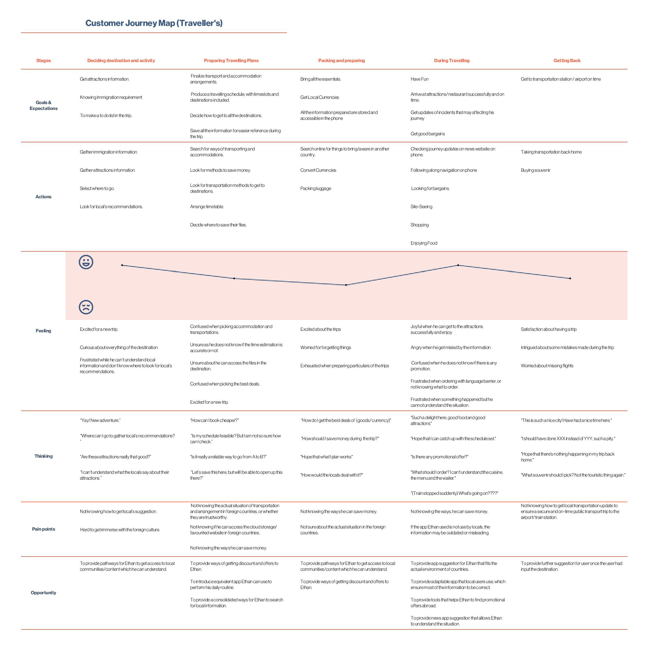
Customer Journey Map
After establishing Ethan and Sally as our archetypal users, I crafted a customer journey map for each to illustrate their experiences and interactions in the context of traveling or migrating. This map outlines the stages they go through, from initial preparation to the actual experience of being abroad, detailing their actions, thoughts, and emotional responses at each step.
(PS: Note for future reference - I experienced some challenges in using Microsoft Excel for this task, particularly when converting the .xlsx file into a high-quality .jpeg image. I recommend accessing the .pdf file for a clearer view of the journey map. I'll definitely consider a more suitable tool for such visualizations in future projects.)

Problem Statement
Following our research, it became evident that mobile phone users often encounter difficulties in effectively utilizing digital products while abroad. The crux of this issue lies in the fact that different countries tend to have distinct preferred digital products for the same functions. This disparity can leave users unaware of the problem or the alternative solutions available, leading to challenges during their travels. In today's world, where reliance on smartphones for daily tasks is ubiquitous, ensuring a seamless digital experience in foreign countries is crucial for both travelers and migrants. Based on these insights, I propose the following problem statements to address these needs:
Systematic Information Browsing:
How might we provide a systematic way for users to access information and tools essential for their trips or relocation, ensuring ease and efficiency in their digital interactions abroad?
Tailored App Discovery:
How might we assist users in finding apps that meet their specific needs in foreign countries, thereby enhancing their digital experience while traveling or migrating?
Simplifying Digital Solutions:
How might we streamline the process for users to discover digital solutions for their daily challenges abroad, saving them time and reducing hassle?
Bridging Digital Experiences:
How might we connect users’ phone usage habits from their home country with suitable digital solutions available in foreign countries, creating a more familiar and seamless transition?
Ideate
After establishing the problem statements, I transitioned into the ideation phase, focusing on developing solutions that align with the identified challenges. This process began with creating an information architecture, followed by developing sketches, mockups, wireframes, and eventually prototypes to visualize the proposed solutions.
Ideas for Solutions:
App Linking for Foreign Solutions:
Recognizing that users are already accustomed to their existing apps, I conceptualized a search tool that allows users to input the name of an app they currently use to find its foreign equivalent. This approach simplifies the transition by leveraging users' familiarity with their native apps, making it easier for them to adapt to similar apps in a foreign context.
Seamless Navigation to App Stores:
To further streamline the process, the solution includes directing users straight to the app's website or its page on the Apple App Store / Google Play Store. This feature eliminates the need for users to search for the app again on these platforms, thereby reducing redundant effort and enhancing the overall user experience.
These solution ideas aim to create a more intuitive and efficient way for users to transition their digital habits when traveling or relocating to a foreign country, addressing the core issues identified in our research.
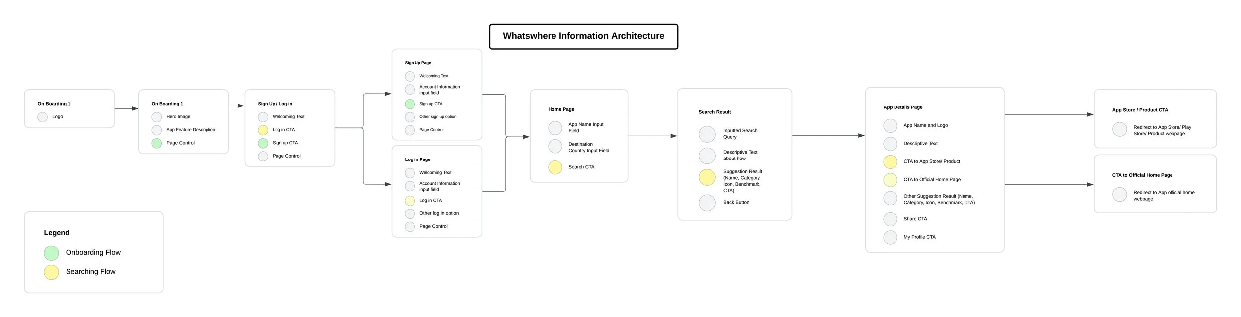
First Information Architecture
In the first user journey map I developed, two distinct paths were outlined to cater to different stages of the user's interaction with the app:
Onboarding Journey:
This pathway is designed to smoothly guide new users through their initial introduction to the app. It encompasses a comprehensive walkthrough of the app's features and functionalities, followed by the user registration process. The focus here is on ensuring that users understand the app's purpose and feel comfortable navigating its interface from the outset.
Searching Flow:
The second journey caters to users who have completed the onboarding process and are now fully registered. This flow represents the regular, day-to-day activity of searching for apps within the platform. It's structured to streamline the search process, making it intuitive and efficient for users to find suitable app substitutes in foreign countries. This journey is crucial as it symbolizes the core functionality of the app and directly addresses the user's primary needs.
These two journeys are integral to the user experience, ensuring that both new and existing users can navigate and utilize the app effectively for their unique requirements.
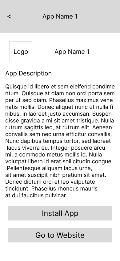
Sketches and Low-Fi Prototype
I initiated the design process by creating primary sketches that capture the essential functionalities of the app. These sketches served as the foundational blueprint from which I developed a low-fidelity (low-fi) prototype. This initial prototype is not only a visual representation of the app’s basic structure and workflow but also a practical tool for early testing.
The primary goal with this first version of the prototype is to evaluate the core app flow. By testing it, I aim to gain valuable insights into the app’s usability and effectiveness in meeting user needs. Additionally, this stage is crucial for gathering feedback from participants, particularly regarding the features they find most useful or desire to see in the app.
This iterative process of prototyping and user feedback is instrumental in refining the app's design and functionality, ensuring that the final product is both user-friendly and tailored to the specific needs of its target audience. The insights gained from this early testing phase will guide further developments and enhancements to the app.


Usability Testing
To ensure efficient design efforts, I began with constructing a minimum viable low-fidelity prototype for initial usability testing. This approach allowed me to gather early feedback on the core functionality and potential feature enhancements directly from users.
I conducted usability tests with 10 participants via Zoom, structuring each session into two parts: a 10-minute task completion and a 25-minute interview. Overall, the participants confirmed that the prototype effectively demonstrated the app's fundamental functionality and could assist them in their daily lives. However, they also pointed out that its limited features impacted the user experience negatively. Their feedback was invaluable for identifying enhancements for the second version of the prototype. Key feature requests and refinements included:
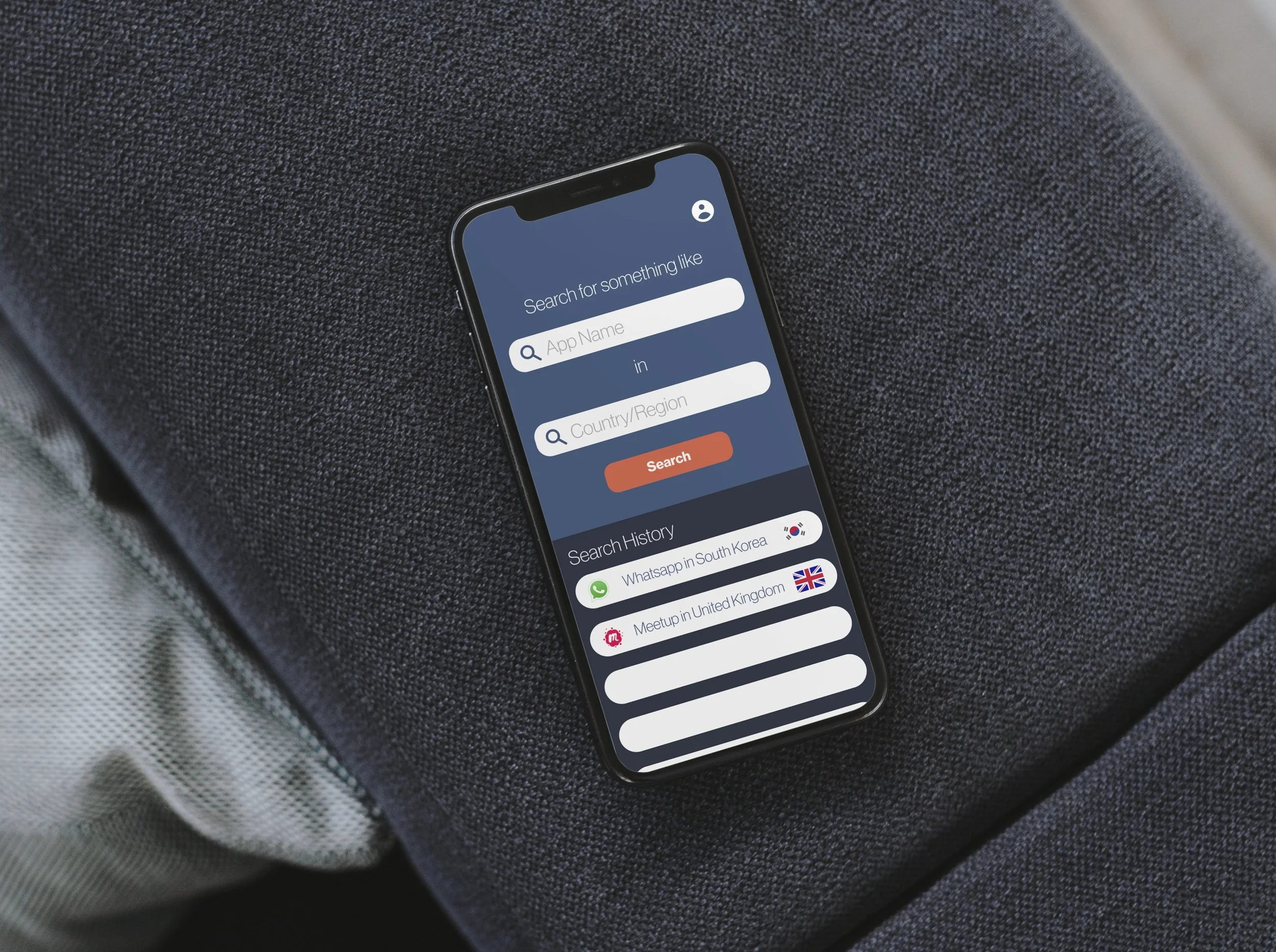
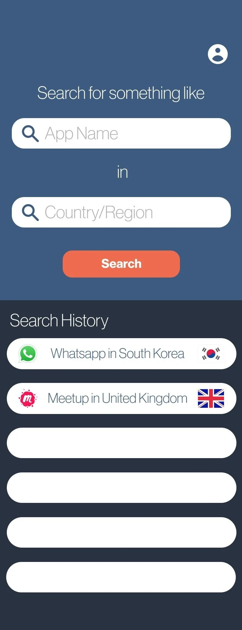
App Saving/Search History:
A systematic way for users to save apps they are interested in or to view their search history.
User Interaction:
Features enabling interactions among users, possibly for sharing experiences or recommendations.
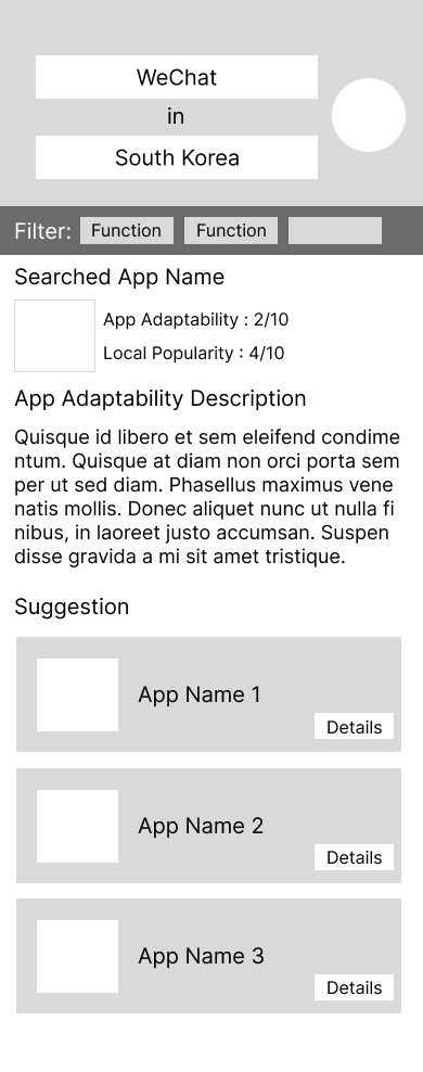
App Performance Abroad:
An intuitive method to understand how an app performs in foreign countries.
App Overview in Foreign Context:
A feature providing an overview of how familiar apps perform in different countries.
Sharing Functionality:
Easy-to-use options for users to share their app findings with others.
Customized Search Options:
Enhanced personalization features allowing users to input more preferences for more tailored search results.
The insights gained from this usability testing are crucial in refining the prototype, ensuring that the final product is not only functional but also aligns with the specific needs and preferences of the target users.
Further Improvement:
In response to the valuable feedback gathered from the first round of usability testing, I embarked on a phase of targeted improvements to enhance the app's functionality and user experience.
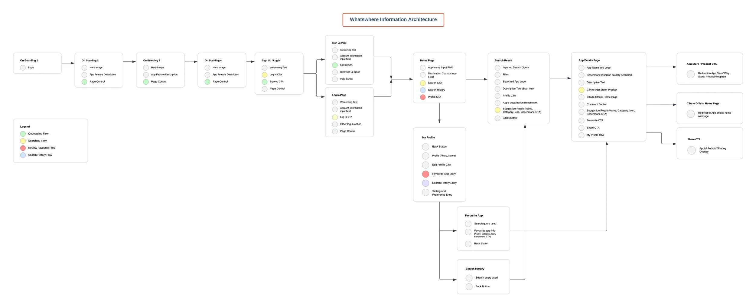
Second Information Architecture:
The first step in this process was to reevaluate and update the information architecture of the app. This crucial step involved strategically planning where to integrate the newly requested features. The updated information architecture aimed to ensure that these additions would be seamlessly incorporated into the app's existing structure, enhancing its intuitiveness and overall usability.
This revision of the information architecture is key to accommodating the new features while maintaining a user-friendly and coherent app layout. It's a delicate balancing act between introducing new functionalities and ensuring that the app remains easy to navigate and understand for the end users.
Sketches and Lo-fi Prototype
With the revised information architecture in place, I progressed to the next phase of design: ideation through sketches, which then transitioned into wireframes and a low-fidelity (lo-fi) prototype.


For easier reference, I’ve put together a document to showcase how I improve my prototypes based on the user feedback gathered in the first usability test, for your reference.
2nd Usability Testing
With the second iteration of our prototype developed, I conducted a second round of usability testing to evaluate the effectiveness of the new designs and features informed by insights from the first usability test.
Test Structure: The tests involved 10 participants, each session lasting 40 minutes. This included 25 minutes dedicated to task completion using the new features, followed by 15 minutes of follow-up interviews.
Participant Performance: Generally, participants were able to successfully complete all tasks with the newly added features, indicating a positive response to the design changes.
Feedback Areas: Participants provided valuable feedback on information presentation, login methods, and visual design. These aspects, particularly important for the high-fidelity prototype development, will be addressed in the next design phase - transitioning into a high-fidelity prototype.
For easier reference, I’ve put together a document to showcase how I improve my prototypes based on the user feedback gathered in the first usability test, for your reference.
UI Kit
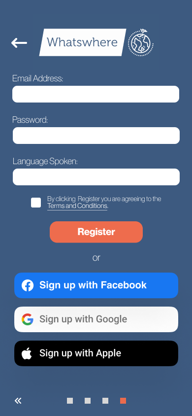
After thinking of the features and layout of the product, we can start adding visual and aesthetic elements to our project. The colour I chose is navy blue, resembling the calm and trustworthiness of our suggestions, and orange, resembling excitement on the trip. I have chosen a Helvetica font for a clean and tidy feeling for the app.

Prototype
Great, let's dive into the demo of Whatswhere! As you explore the demo, you'll experience firsthand the features and functionalities we've developed based on extensive user feedback and testing. This will give you a feel for how the app operates and its user interface, allowing you to see how it addresses the needs of travelers and migrants in adapting their digital habits abroad. Enjoy the exploration and feel free to share any thoughts or feedback you might have!


Reflection
What's Next for Whatswhere
The development of Whatswhere is ongoing, with several enhancements envisioned for the future to transform it into a comprehensive digital hub for migrants:
Related App Suggestions: Plan to recommend other relevant apps used in the destination, broadening the scope of digital adaptation for users.
Smart App Adaptation Alerts: By identifying apps installed on a user's phone, Whatswhere could alert users about apps that may not work in their new location and offer suitable alternatives upon their arrival.
Migrant Favorites Compilation: Utilizing search queries to compile a list of popular apps among migrants, potentially offering them as a bundle for easier access for other users.
VPN Utilization Highlight: Indicating when an app can function in a different country or region with a VPN, potentially saving users from needing to adapt to a new app.
Enhanced Personalization: Asking more specific questions to provide accurate app suggestions, like inquiring about preferred supermarkets for membership apps.
Lessons Learned
Step-by-Step Approach in Design (Figma): I learned the importance of not rushing into design. Initially, I was so enthused about my ideas that I jumped into creating elements and layouts without a structured plan, leading to challenges in maintaining a consistent visual style. It's a reminder to approach design methodically.
Continuous User Feedback: This project reinforced the value of building a minimal viable product and then iterating based on user feedback. Users often provide unexpected yet valuable insights and critiques on new features, driving continuous improvement. This approach underscores that product development is an evolving process, always open to enhancement.
Continuous Evolution
The journey of Whatswhere doesn't end here. It's an ongoing process, reflecting the idea that a product is never truly 'finished.' There will always be new opportunities and areas for improvement, and the key to addressing these is continuous engagement with user feedback and a commitment to iterative development. Whatswhere's evolution will be guided by this philosophy, ensuring it remains responsive to user needs and market dynamics.